All Profile Comments for CheshireKitty
| Times Rated: | 280 |
| Rating: | 9.689 |
| Showing: | 151 - 175 of 280 |
i get tired of all the stamps that take the place of real comments. i understand that the stamp itself can be art in and of itself, and that's fine. what i despise is when it takes the place of the comment itself.
and i do actually read profiles. i read every one i visit.
Well your profile is worth more than a 2 for a regular member. Only thing wrong in my opinion would be your headers.... Present, Future, VampireRave.. they're off centered. Also maybe try a different color than the red font but this is all just my own personal opinion.
I'm not trying to be mean or snotty here because I know my profile sucks at the moment but that's by choice because I'm too lazy to fix it up. lol
Great job though.. definitely worth more than a 2. :)
lovely profile.. interesting study topic. good luck with it
What part (s) of England did you visit? I live near London
rode by 2 giv a 10 an lyf means life an the flag is huge part of my family history otherwise id let ya hav it lolz thanks 4 ur rate :)
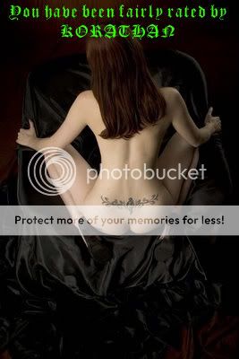
RATED FAIRLY
BY
PROUD ACM

U get an 8 now just bc u have no problem with my attitude an thats reare
 ivor
ivor
23:24
Apr 05, 2010

Feel free to add me, if you do please tell me so I may return the favor & add your Journal as well.
Thanks!
I used the 'Kristen ITC' font. Theology classes are awesome. If you enjoy any kind of ancient history, Theology is a great study.
Aboru Aboye Abosise! I will NOT grant automatic 10s, you have to EARN it, if you feel unjustified by my rate then please refer to my profile for my rating system. If by chance you do receive a low rate, please ensure that you check your own profile for content before you consider revenge rating. Once you have updated your profile, please do message me as I am always glad to return and re-rate.

Add me to your friends list. Add my journal to your favorites.


And Stalk me. But let me know, so I can do the same. Thank You.
"The Immortals are the highest ranking members within Vampire Rave. They are members of level 100 or higher and are the most active members of Vampire Rave. If they rate you they can elevate or crush your rating in an instance."
| 1 - 25 | 76 - 100 | 101 - 125 | 126 - 150 | 151 - 175 | 176 - 200 | 201 - 225 | 226 - 250 | 251 - 275 | 276 - 280 |
REAL VAMPIRES LOVE VAMPIRE RAVE
Vampire Rave is a member of
Page generated in 0.0612 seconds.